

I received this marketing email Friday from Bradley. It included two images and noted that it’s only going to be open until Oct. 17.
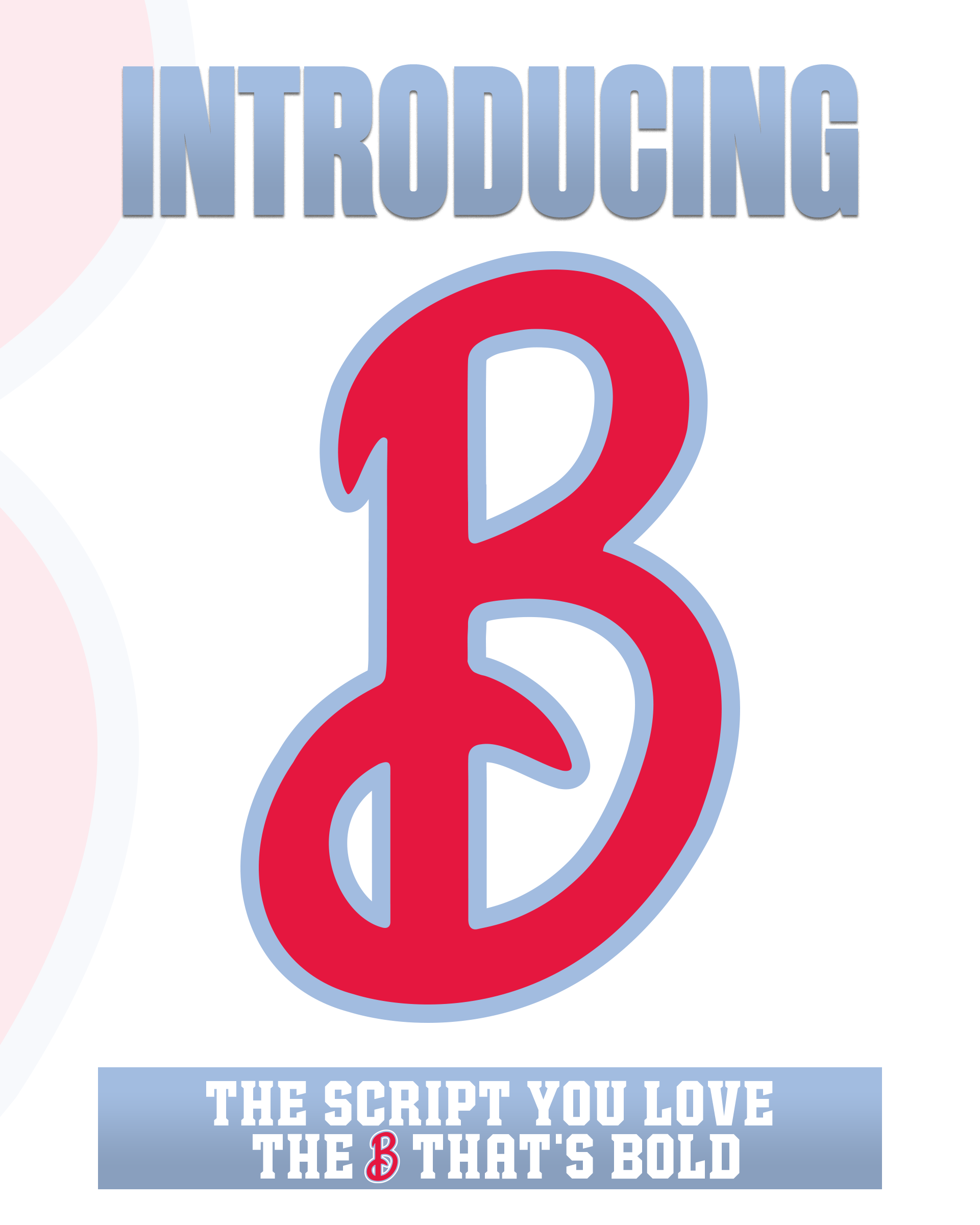
The first was showcasing the script “B” that has grown in popularity recently:
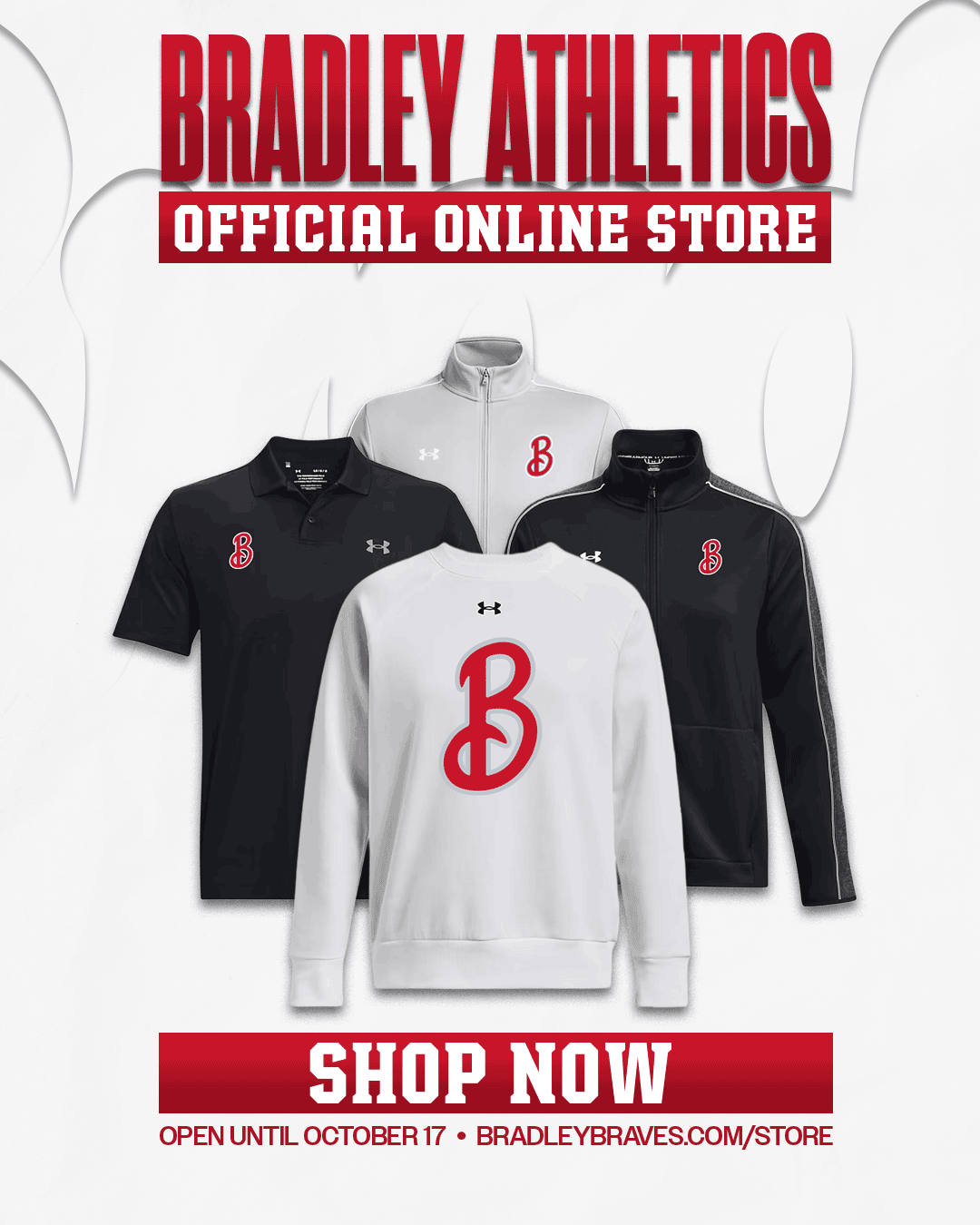
The second was a rolling image showing some of the merchandise a person can buy with it displayed:
So, while on it’s surface, this appears to be something that is just a way to sell more stuff and generate revenue from the school, I feel like there might be more here. Otherwise, why would I be writing about team apparel?
Let’s think more deeply on this one.
Backstory
I could write a series of articles about the Bradley logos and it’s lengthy history. It’s something for another time though, as it’s mostly relevant to discuss more recent updates.
In 2012, Bradley moved to their shield “B” logo that has generally been received positively from discussions I have seen and read during the years since it’s arrival.
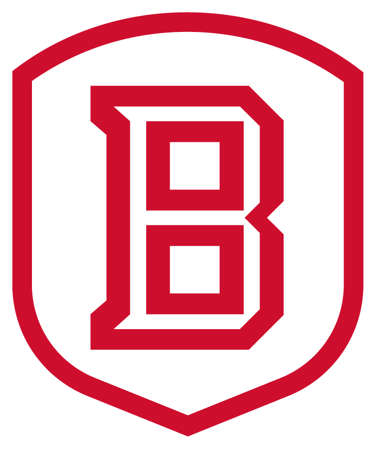
Image credit: sportslogos.net
Then in 2022-23, Bradley began using an alternate jersey with script writing. It was a reference to a jersey worn in the 80s but as is a trend where “old is cool again”, it completely took off. It was so popular that it turned into the main home/road font for the regular game jerseys.
Image credit: sportslogos.net
This is where the script style has stood going into this season.
Why is this interesting?
Marketing is often a test bed to gauge interest in a new venture, whether it’s a new type of apparel or using a different branding style.
The part that is striking here is that Bradley didn’t just add this to their bookstore shop, but they created a separate popup shop via Fevo.
You can see the store here: https://www.gofevo.com/group/2025bradley27
Teams do this sort of thing often, especially when it’s for a particular event like a playoff victory. It allows them to purchase only a certain number of the items and save on costs of printing and having to store/sell merchandise that hasn’t been sold.
This situation is slightly different since it’s not around a particular event (Bradley actually used Fevo recently when trying to sell jerseys with the script logo). Instead, it’s chance to test to see how popular it is. Where do we go from here?
Angle 1: More $$$
The simplest way this goes is that these sell at least a little bit and Bradley makes a profit on them. It doesn’t explode like the script jerseys but it’s at least a win from a little bit of revenue. Also, since the shop is only on demand, the school doesn’t have to sit on merchandise that isn’t selling.
Angle 2: New alternate logo?
This is the more interesting (and potentially divisive) option. I can’t really speculate on what the marketing side at Bradley would consider this a big success in sales, but if it reaches that mark, there has to be discussions about potentially registering it as an official alternative logo.
It’s also interesting that within the Bradley University branding guidelines, there’s no reference to the script logo at all. While I know the school and the athletic department aren’t necessarily the same thing, it’s still relevant to understand that that script is niche, even at the school level.
Bradley University Branding Guidelines
Even if it’s just used at the athletic department (or more specifically, Men’s basketball only) level, this usage is a pretty radical departure from the shield “B” logo if you’re separating it out on it’s own.
My opinion
I’ve been staring at the shop stuff off and on since Friday when I got the email. This particular topic flummoxes me a bit. One one hand, at least when it’s used as a small lapel logo on a shirt/sweatshirt, it looks pretty good to me. The really large “B” doesn’t resonate with me, but I’m guessing this is for a different demographic (younger) than me.
But, mostly, I think I lean on the “no” side for it, only because if I look at it strictly from a branding perspective and I try to look at the logo on its own, it doesn’t strike me as “BRADLEY”.
Even with the more limited national profile that Bradley has, the shield “B” is something that is hard to confuse with other schools. The two other well known “BUs” (Belmont University, Boston University") are decidedly different. (I know Baylor is also a BU, among a few other schools, but their colors are so wildly different, it’s not really every a confusion point.)
Belmont has much more of a focus on their Bruins mascot as well as blue being a predominant color.
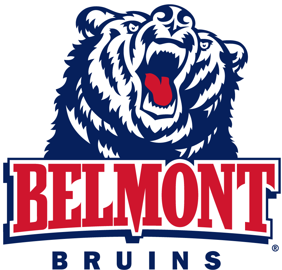
Image credit: sportslogos.net
Boston U. has similar colors but always is using “BU” versus just a “B” when you see their logo so it also isn’t as easily confused with the previous BU Braves logo.
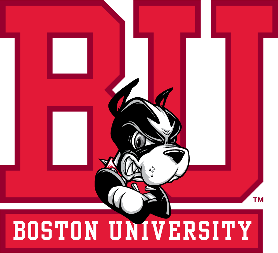
Image credit: sportslogos.net
So, when you go back to just using a script “B”, it doesn’t really connect because of the more formal-looking style that Bradley uses for it’s fonts.
What do you think? Do you like the logo and could it become an alternate? Or is it just something for a marketing campaign and won’t be seen much past the popup shop?
I do like the script logo and could see it being used as an alternate; however, I wouldn't want to see it as a replacement. The Under Armour hoodie with the large script "B" is pretty cool though!